To Work with Certainty
The Colour Chart by Claudia Valsells
To Work with Certainty
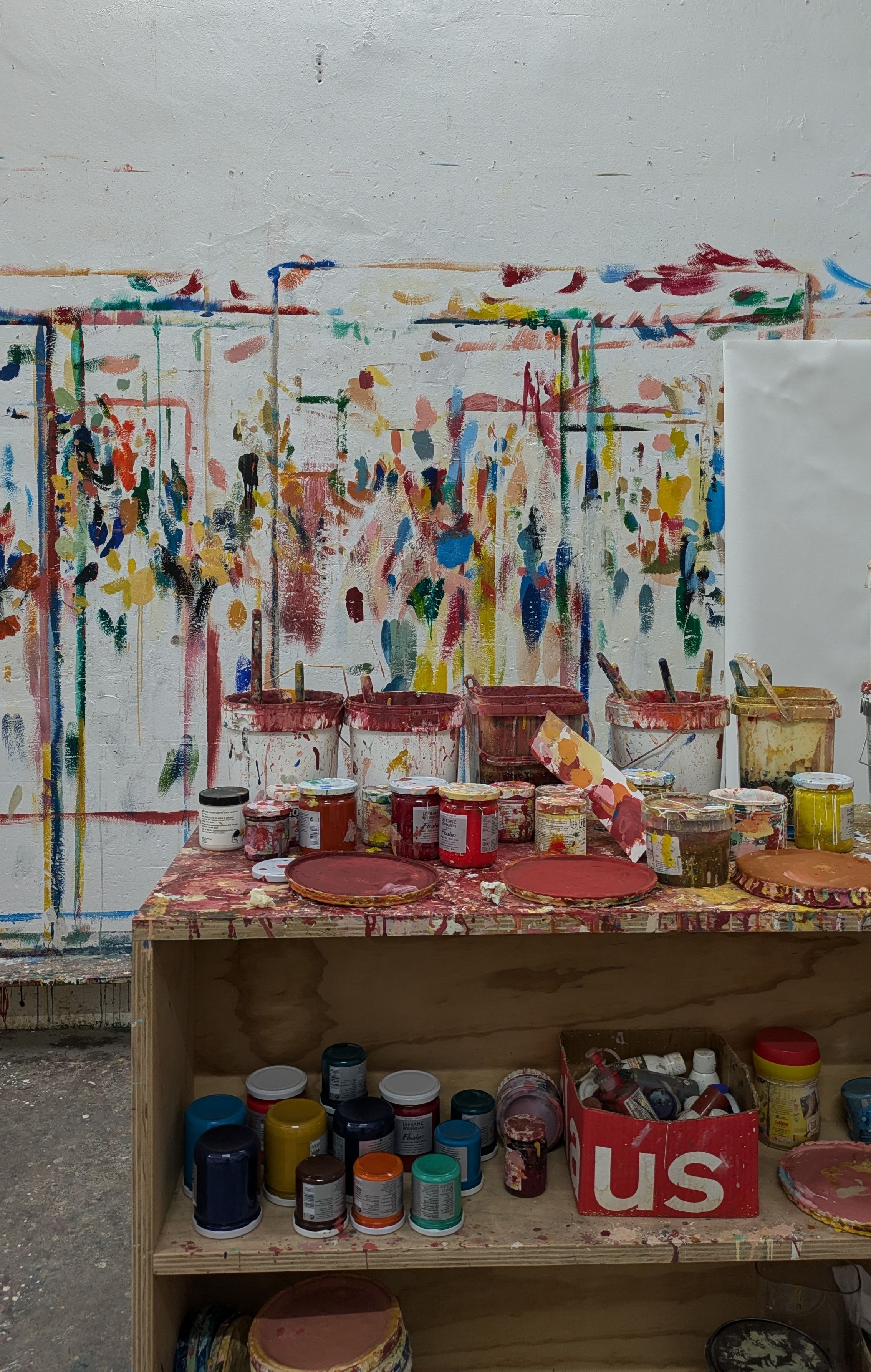
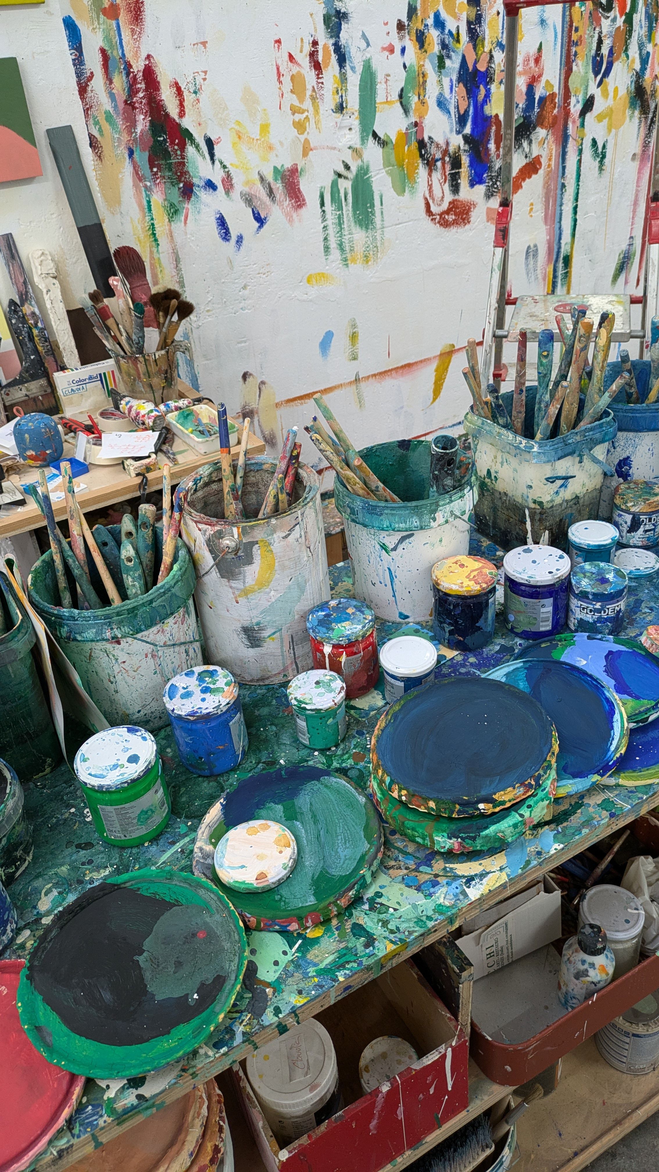
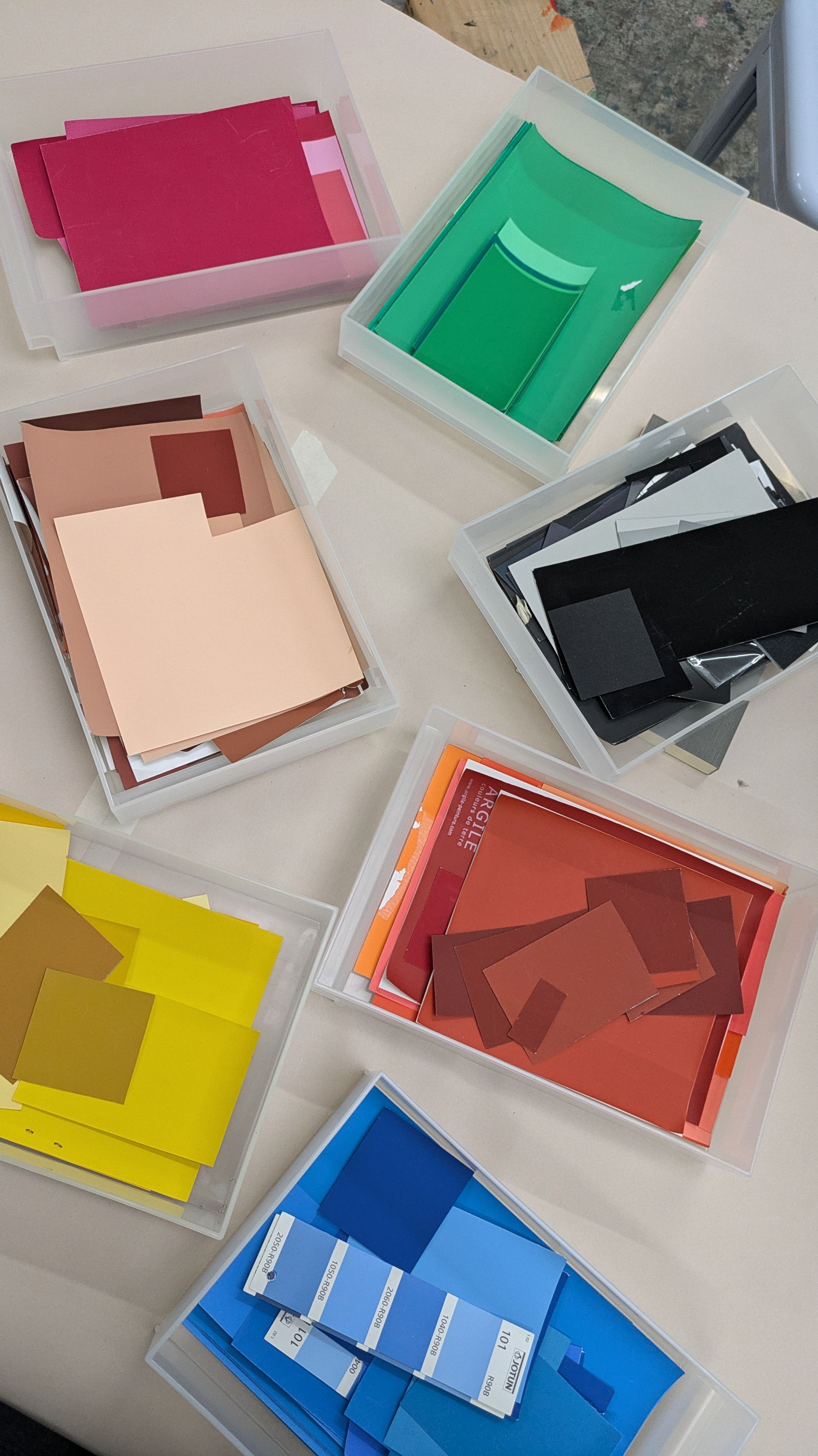
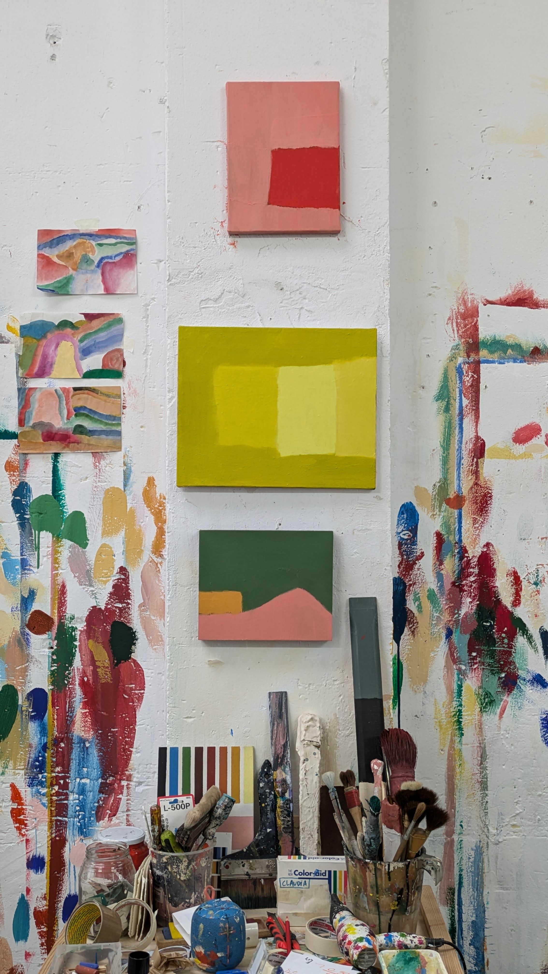
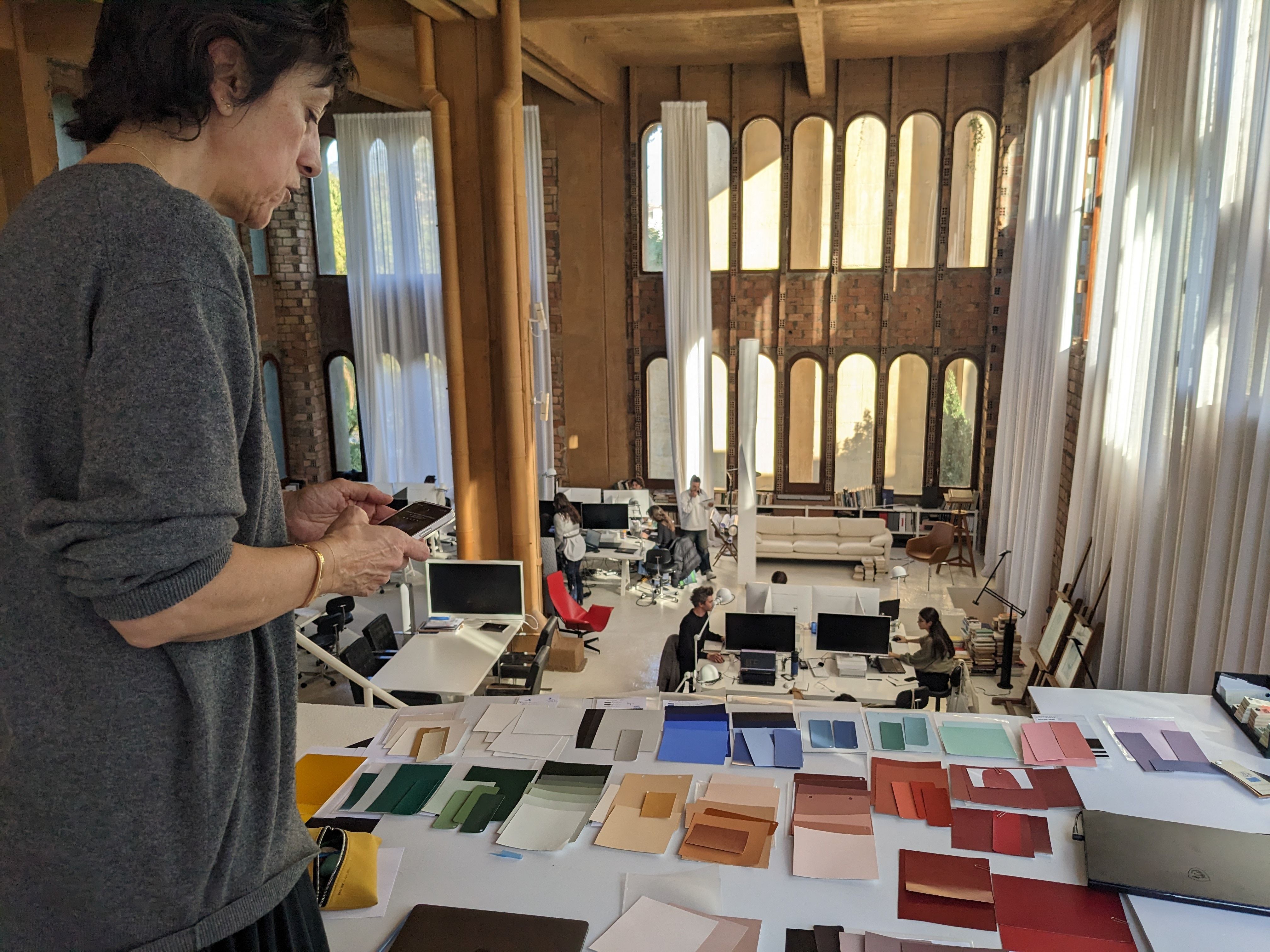
One of the first things to catch my eye in Claudia’s studio is a shelving unit filled with semi-transparent drawers – some 2,000 colour references stored just above her desk. Canvases in various stages of completion line the walls, while finished works wait nearby. Tables are cluttered with jars of paint, and brushstrokes seem to have wandered across every surface. But it’s those drawers – stacked like something from an old hardware shop – that I’m drawn to, perhaps because they best reflect her approach. Instinctive, methodical, precise: Claudia Valsells has become a trusted collaborator in the worlds of architecture, interior design, and furniture. She is also an established artist in her own right. The following interview distills three hours of conversation with Claudia, only touching the surface of over thirty years of work (which I encourage you to explore further in your own time).
How did you develop this interest in colour?
I think it’s a primal curiosity, very much fueled by my parents. My mother is an art historian and would often turn family time into a cultural experience. My father had a painting application company, which stemmed from my grandfather’s and uncle’s paint manufacturing business. But it was the Expressionists and Fauves, with their bright colours that didn’t correspond to reality, that sparked my curiosity. When it came time to choose a career, my family wanted me to study economics. I agreed, as long as I could also go to a workshop. So I started painting in a house-workshop on Carrer de Canet in Barcelona when I was twenty. At that time I knew nothing, so I’d go to the warehouse manager at my father’s company and ask for materials to manipulate, like aggregates and pigments. They’d give them to me, and I’d go to the workshop to conduct my experiments.
Were you self-taught back then?
I’ve always bought art books and travelled – those have been my sources. In my early years with painting, I focused on the Catalan informalists like Tàpies, Ràfols-Casamada, and Hernández Pijuan. Later I was drawn to American Expressionists like Rothko. I had this duality: the informalists, who were very material-based, and the Expressionists, who dealt with colour in a profound way. My interest in art grew, but I didn’t want to study fine arts. I wanted to train in mural painting, so I went to Brussels to the Van der Kelen et Logelain school. Back then – and still now – I was obsessed with transferring colour to specific surfaces. In Brussels, I was taught the painter-decorator's trade: priming, coating, profiling, varnishing, and, of course, making oil and watercolours, marble and wood imitations, trompe-l'œil, etc. I left Barcelona very informalist and returned with a technical knowledge that I still use and refine today.
What did you do after Brussels?
I returned to my workshop and started teaching, which coincidently led me to my first clients. One day, my father’s company, PIPSA, was painting the house that Oscar Tusquets was building, but there was something his workers didn’t know how to do. Oscar wanted to reproduce Pompeian paintings on the interior walls, and I dared to do them. That’s how I met him and was able to apply what I'd learnt in Brussels.
We’re talking about the late 90s and early 2000s, right? Decorative painting was all the rage.
Yes, the painter-decorator was in high demand among interior designers, so the amount of projects started to grow, and architects began to ask me for advice on the use of colour in their projects. At that point I needed to give my studio a name. I called it Arts & Claus, inspired by the Arts and Crafts movement, to pay tribute to trades, and to incorporate my name. Not long after, I also had to manage the painters from PIPSA, going from six workers to almost fifty, and from two projects to about twenty.
What was your role at the studio? Were you still able to paint?
Up to that point my vocation had been painting and colour, and my main focus was to learn and evolve from the trade of painter-decorator. When I had to take charge of so many people, I dedicated myself entirely to managing a team of painters, from apprentices to master painters. I learnt a lot about the trade through them, and at the same time I expanded their knowledge of colour, creativity, and aesthetics. The positive side of this experience was being able to get large-scale projects with top-tier workers and lead the chromatic aspect from the beginning. During those twenty years, I stopped painting walls, but I still painted canvases in my free time.
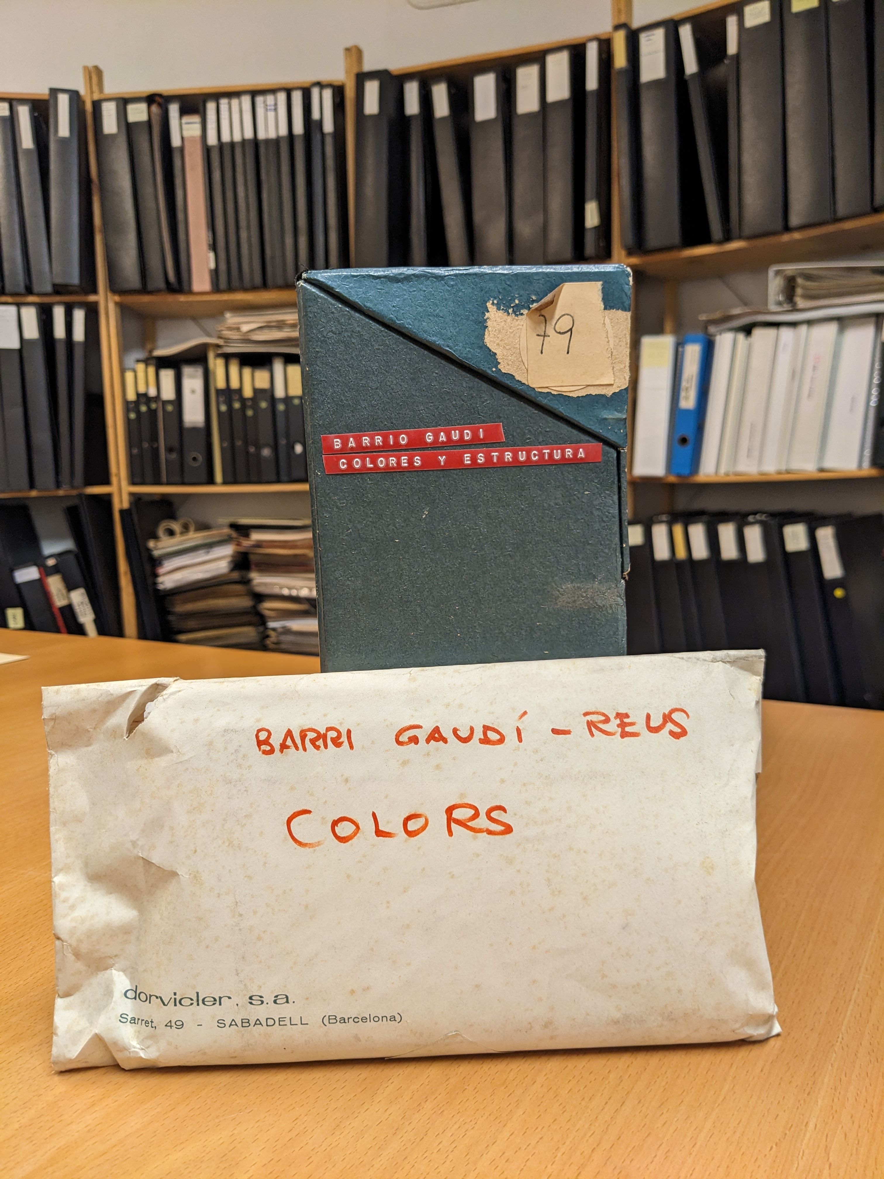
You're known for creating a colour chart. Can you tell me how that came about?
I decided to create a colour chart for architects and designers because they needed to be able to communicate colour to their specifiers. In 2000, I created Arts & Claus Colors, a timeless chart that's still in use today under the name Artist Colour Chart. I thought – and I still think – that the colour charts on the market offer a broad range of tones that don’t take into account the aesthetics or precision that architecture requires. For the creation of this physical chart, I followed an artisanal process that would be difficult to replicate today. Each colour was made into a real product, and each colour strip was manually painted with a spray gun. That’s why the texture and appearance of each colour are 100% real.
The terms colour and texture-support come up a lot in our conversations. It's also interesting that you started painting on canvas in your workshop, then expanded to walls, to mural painting, and now you’ve returned exclusively to canvas.
I don’t know why, but the idea of having limits made me feel uncomfortable, so I started painting the walls. One very positive thing about the work I’ve done in architecture is that it’s allowed me to delve deep into the behaviour of colour in relation to the surfaces where it’s applied. In the materiality, light, and interaction between colours. That is, how colours behave depending on who they are connected to, how they are affected by light, and what surface they are applied to. The interaction of colours in architecture is just as important, if not more, than colour itself.
I’ve got Albers and Scully written down here.
Albers’ colour theory is exactly that, the interaction of colour. Scully is a reference, but as an artist. As for an architect, it's Barragán.
Returning to your colour chart, it's well-known in the world of architecture and interior design. How did it go from a tool born of your own needs to one sold to the public?
After going to the editorial world and not being convinced, I decided I was going to self-finance it, as long as I could find somewhere interested in selling it. I went to Fernando Amat’s office at Vinçon on the day he received suppliers. After waiting in line, I spoke with him and said: “Hi, I’m Claudia, I’m a painter, and I want to make a colour chart, but I’ll only produce it if you sell it.” It was sold at Vinçon, also in my showroom, until both of us closed.
There then comes a moment when you close your studio and focus on your artistic work.
Yes, after the 2008 crisis I closed the company and dedicated myself to painting canvases. It wasn’t until 2013 that Miquel Alzueta became interested in my work, and since then I haven’t stopped. Now I combine this with my role as a colourist, consulting and doing small projects that interest me.
And one of those projects comes from the Taller?
Yes, the Taller project is the most beautiful one I’ve done as a colourist. Hernán Cortés contacted me and said something that immediately resonated with me: “I need to organise the work of the Taller chromatically.” I found that a very sensitive point of view. I would have expected an architecture studio to prioritise volumes, shapes, and use, but colour? I thought it was wonderful.
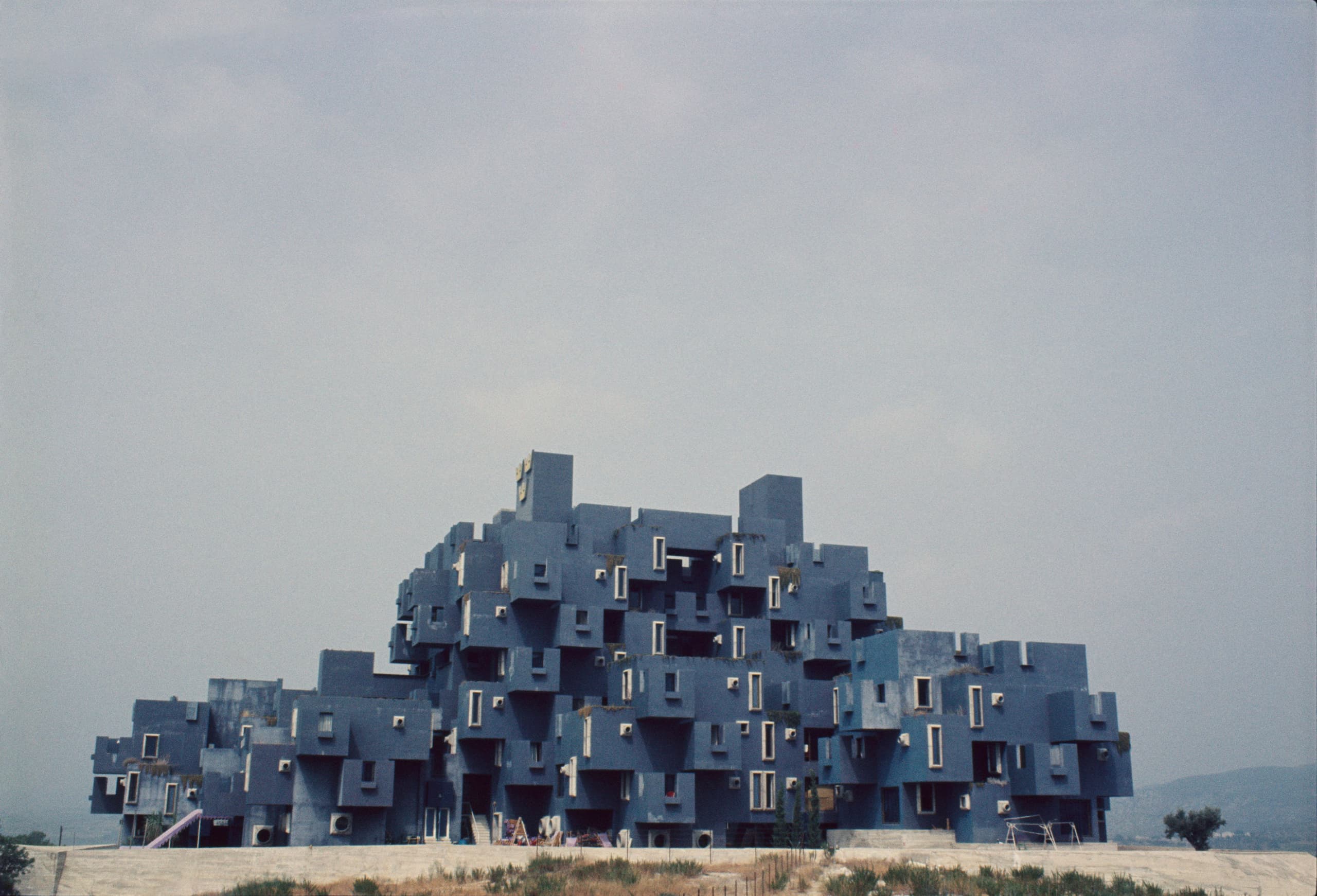
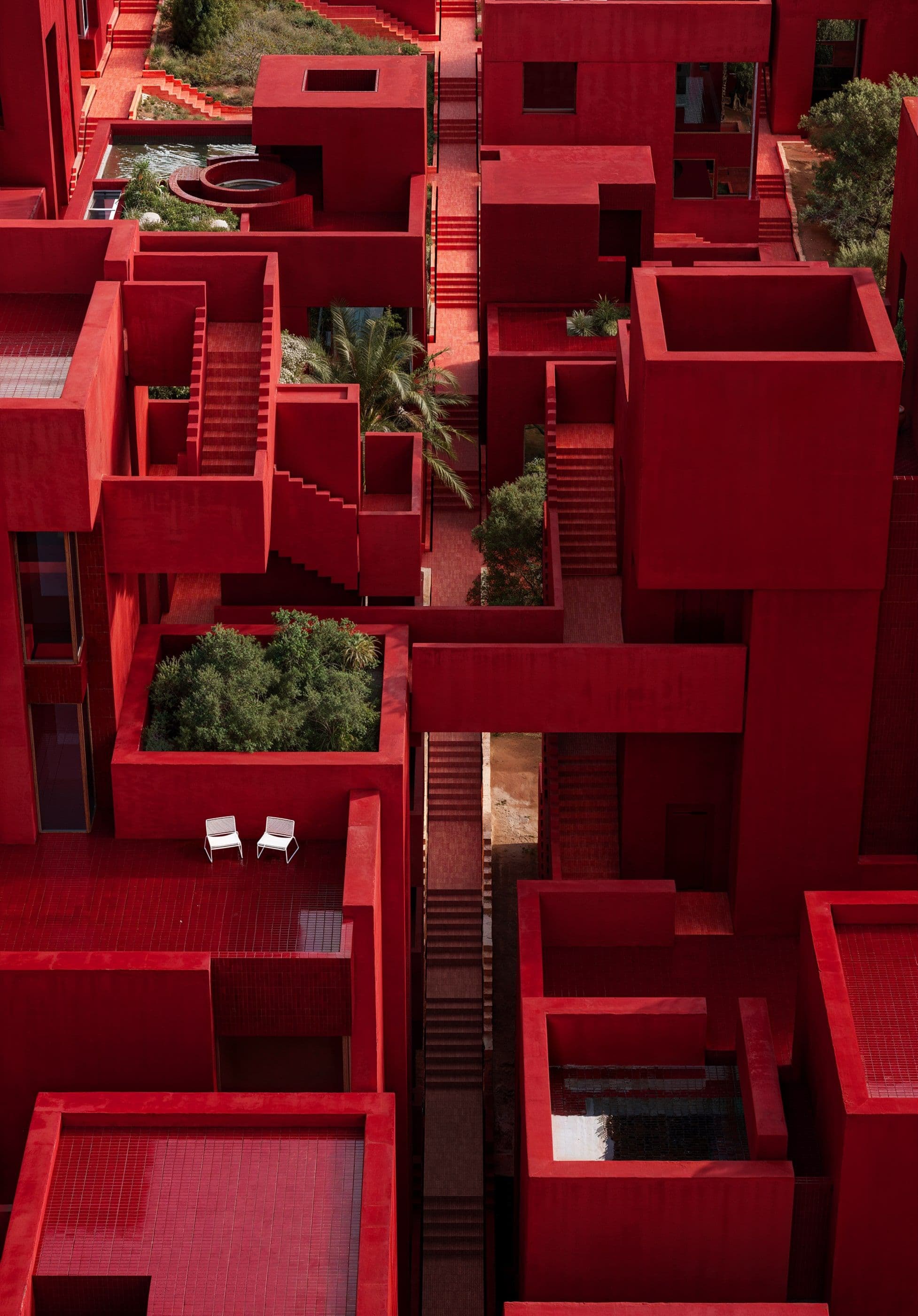
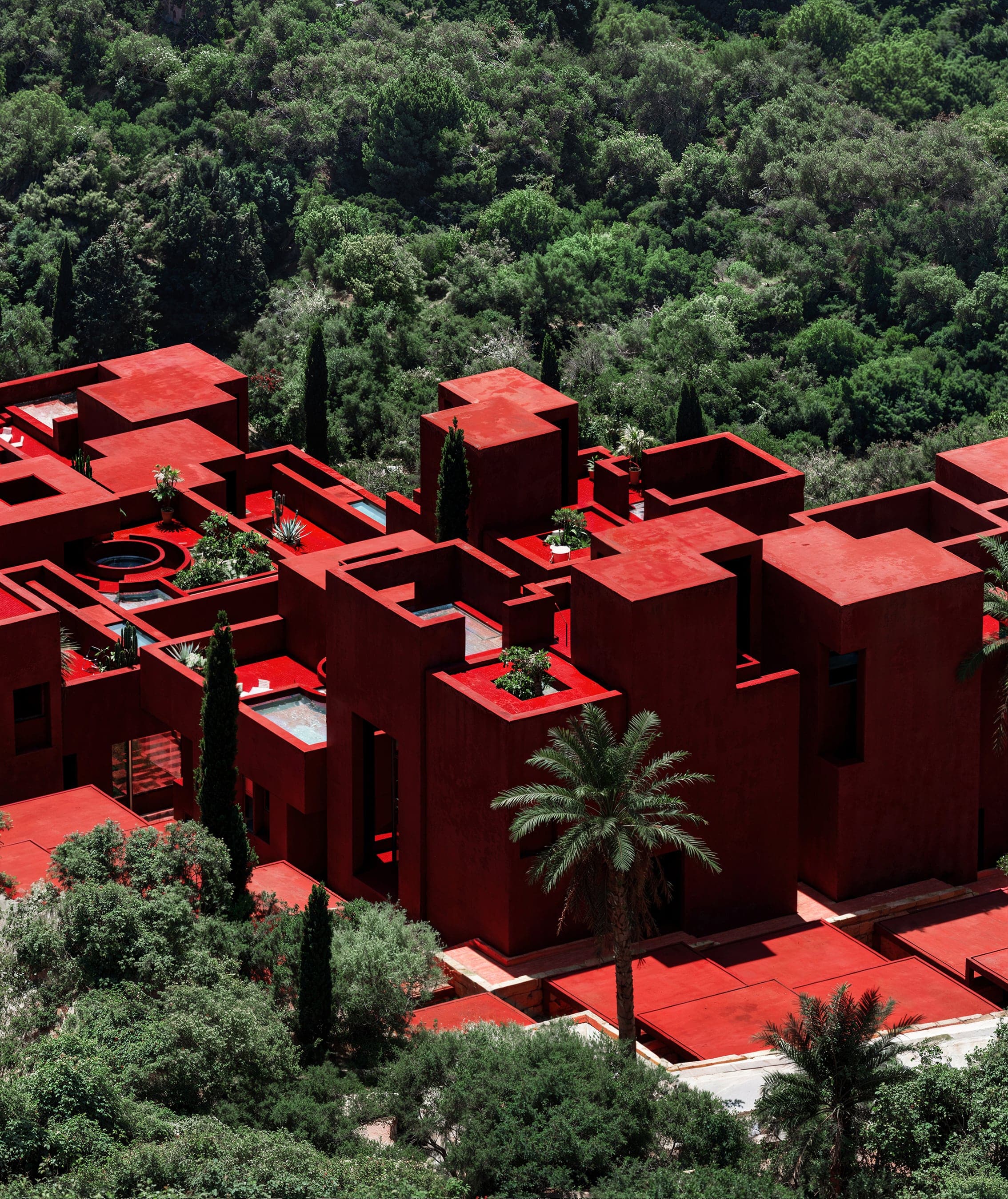
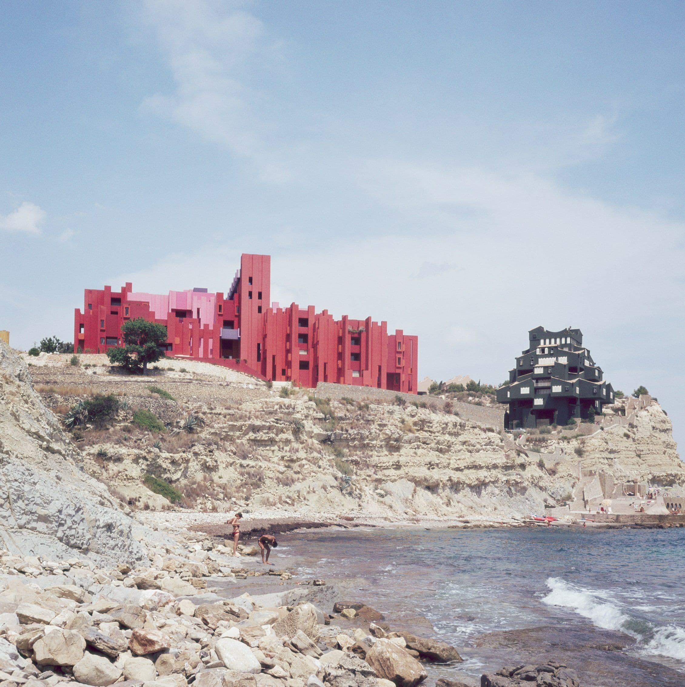
In addition to this long-term project, there was a more immediate need: advising on painting La Muralla Roja.
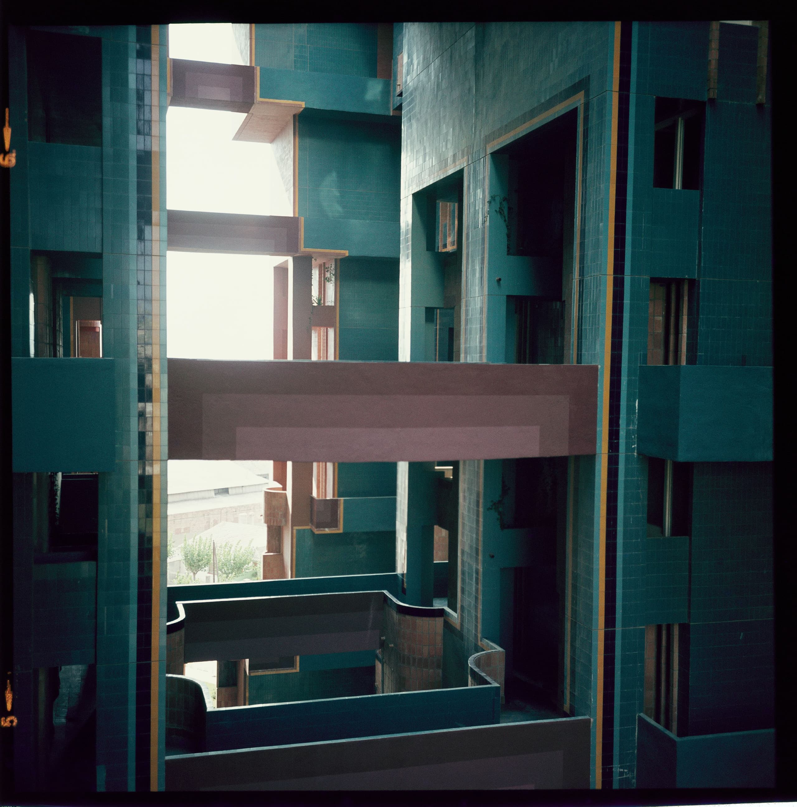
Exactly. It was a stroke of luck that the residents contacted the Taller for advice on the colours, as rehabilitating it required a certain rigour. The colour of this building had been greatly distorted: it had undergone many unfortunate interventions in its history, the colours had aged and lost intensity, and the base mortar probably wasn’t of the highest quality.
How did you approach the project? What was your approach with colour, and what did you base your decisions on when defining it?
I accepted the project on the condition that I wouldn’t rely on samples, but rather on my personal interpretation, based on my experience and my sensitivity to colour. The neighbours gave me many photographs, and among other things, I consulted the colour chart created at my grandfather's paint factory. It was made with tempera paints, contemporary to the time when Bofill designed the resort in Calpe. With all that, I made a subjective interpretation of what the Taller likely envisioned back then. It’s not that we don’t take history into account, it’s just that we won’t be able to reproduce the original colour: first, because the materials no longer exist; second, because some of the original colours aren’t stable in the light; and third, because the chemical industry has evolved a lot, and so has the materiality of colours.
So, some liberties were taken.
Yes, some liberties. Some colours, like lilac or blue, had to be adapted to allow for light stability and therefore durability. It was an interpretation. In this process, Hernán’s sensitivity was crucial. Initially I prescribed a more orange-red – perhaps influenced by Walden 7 – and he told me, “I don't think that’s it; I see it more red, not so terracotta.” Colour involves each person’s sensitivity, and I think he has great talent with colours.
Other buildings from that period at the Taller are known for using colour as a powerful element.
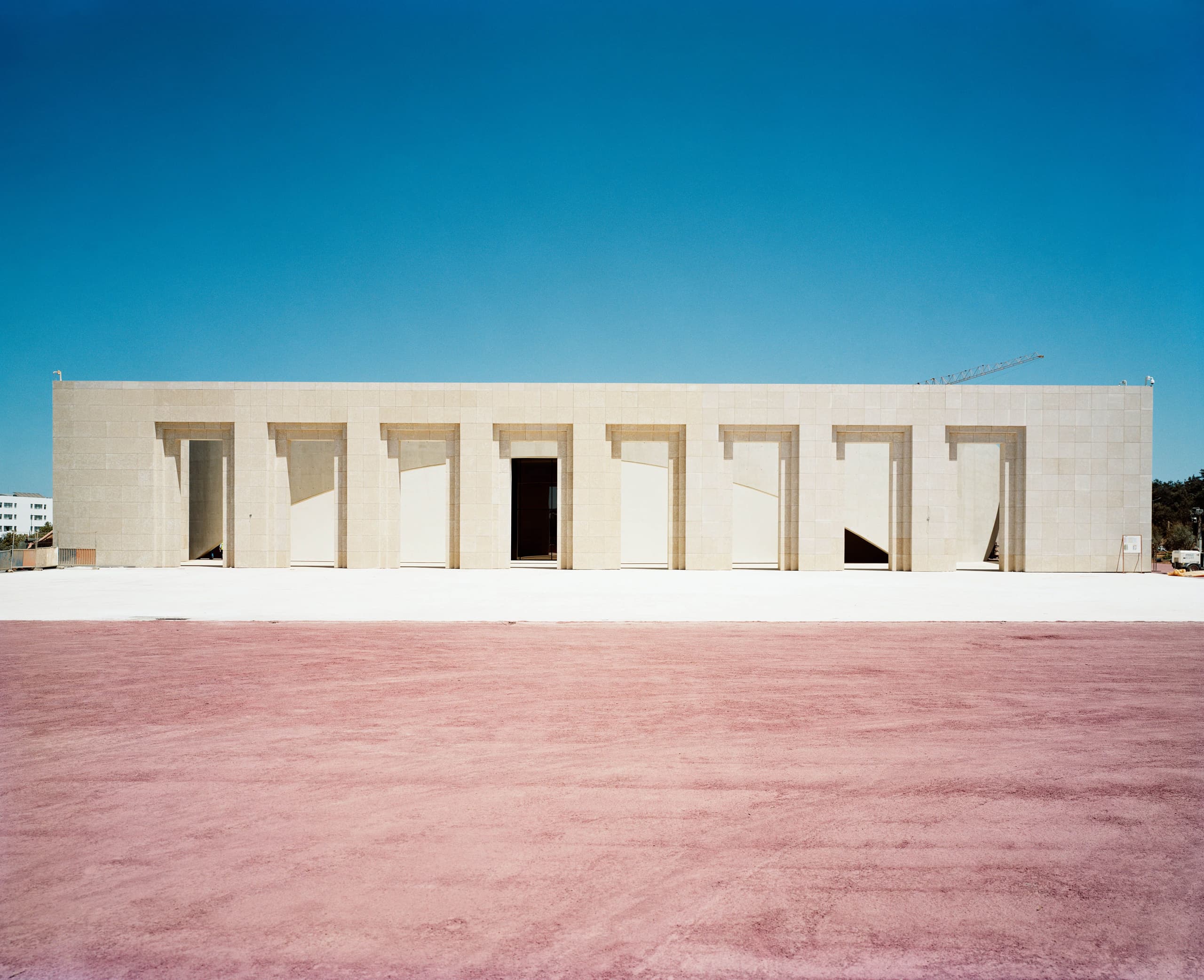
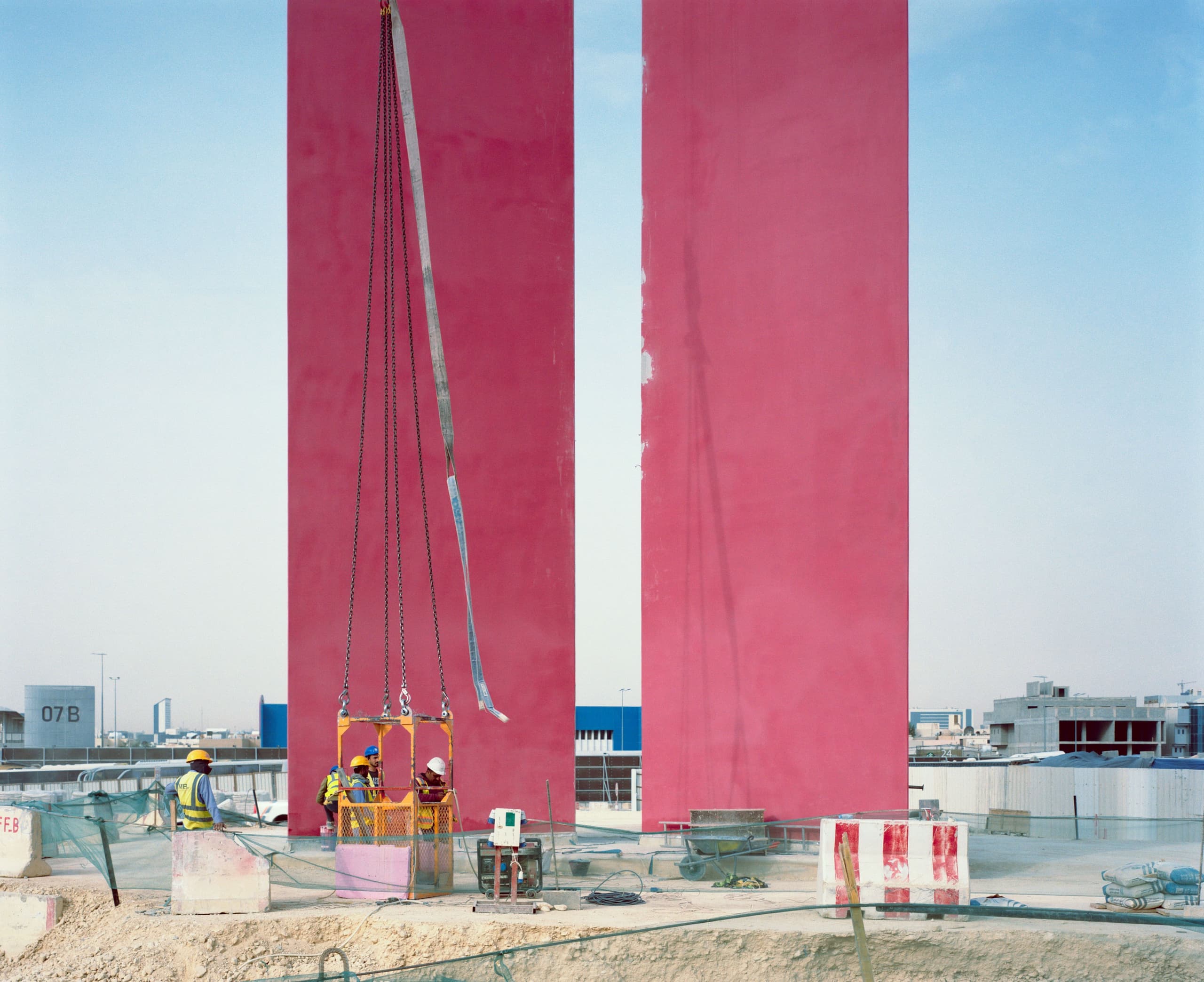
I think Ricardo’s use of colour in his architecture was wonderful. I believe the most daring act was using such large masses of colour. Using colour on that scale is the most impactful; the gradations are the subtlest, and the combinations are the most genuine. It’s an extraordinary thing. I like to imagine that back then, they conceived buildings as they lived: inspired by their travels, conversations, and other disciplines. And for me, the more you talk about colour, the better it gets, the more it dialogues.
We could talk about boldness, experimentation, and disruption, but above all, it’s evident that there was a rigour with which the colour was applied.
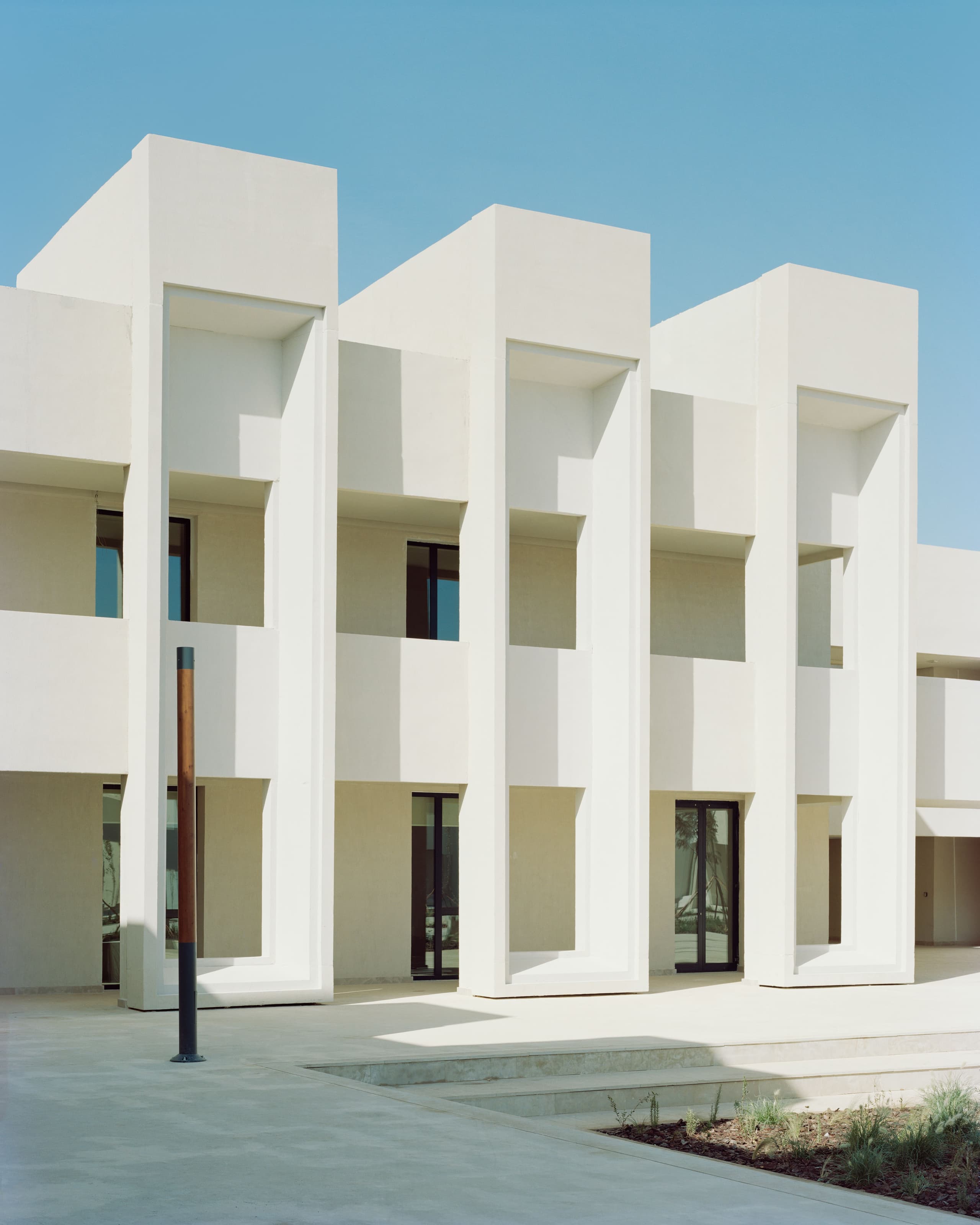
Absolutely. Together in the archive we’ve seen colour tests from various projects, and it was very studied. But there’s also rigour in how colour organises buildings, hierarchising floors, circulation, etc.
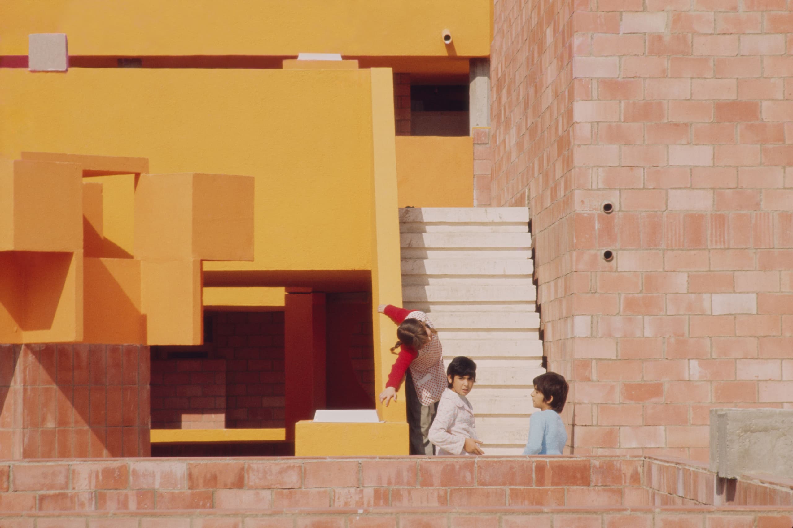
At Barrio Gaudí, for example, the colour even becomes part of the identity of the residents, don’t you think? It’s beautiful how people identify with the colours they live with.
Colour is universal, everyone understands it, in their own way and to their capacity. It can be used in many different ways. I’m reminded of Le Corbusier, who also used colour to hierarchise, create depth, and frame spaces. The tones and placement of colour varied depending on the meaning he wanted to convey.
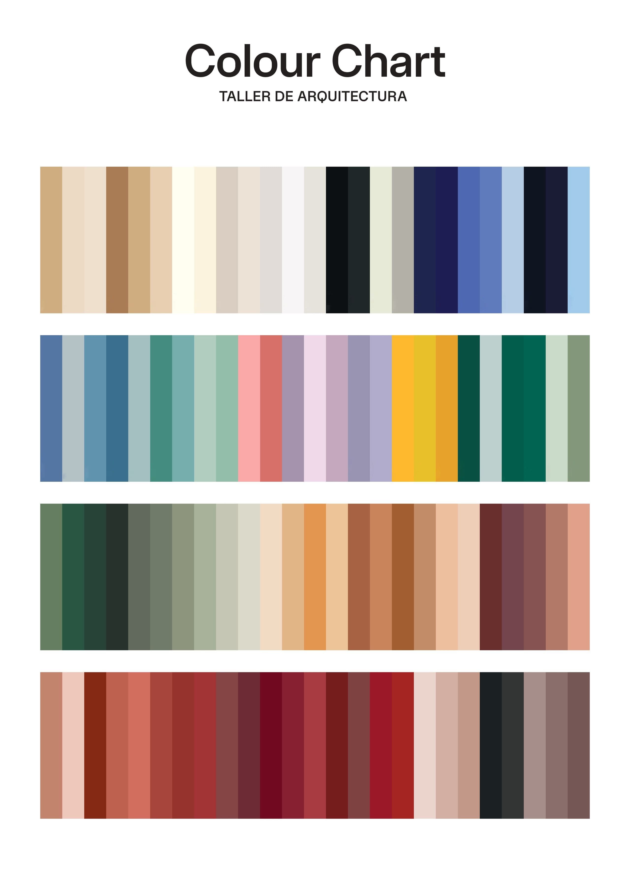
Returning to the initial commission, this finally materialises as the Colour Chart. Tell me a bit about how you started to immerse yourself in the chromatic universe of the Taller.
Well, it was made clear to me that the goal was to preserve Ricardo’s chromatic legacy – the use of colour in the projects as an important part of his architecture. There was a need to define the Taller’s colours. There are a lot of people in the studio, with different nationalities and their own life experience and knowledge of colour. Everyone associates colour with something. But what was needed was for all the projects, no matter who worked on them, to have the Taller's DNA. At that time, I knew Walden 7, La Muralla Roja, Barrio Gaudí, but not much else. So I did a historical study, looking with squinted eyes: okay, there are reds, blues, greens... I repeated them endlessly until I came up with the basic families.
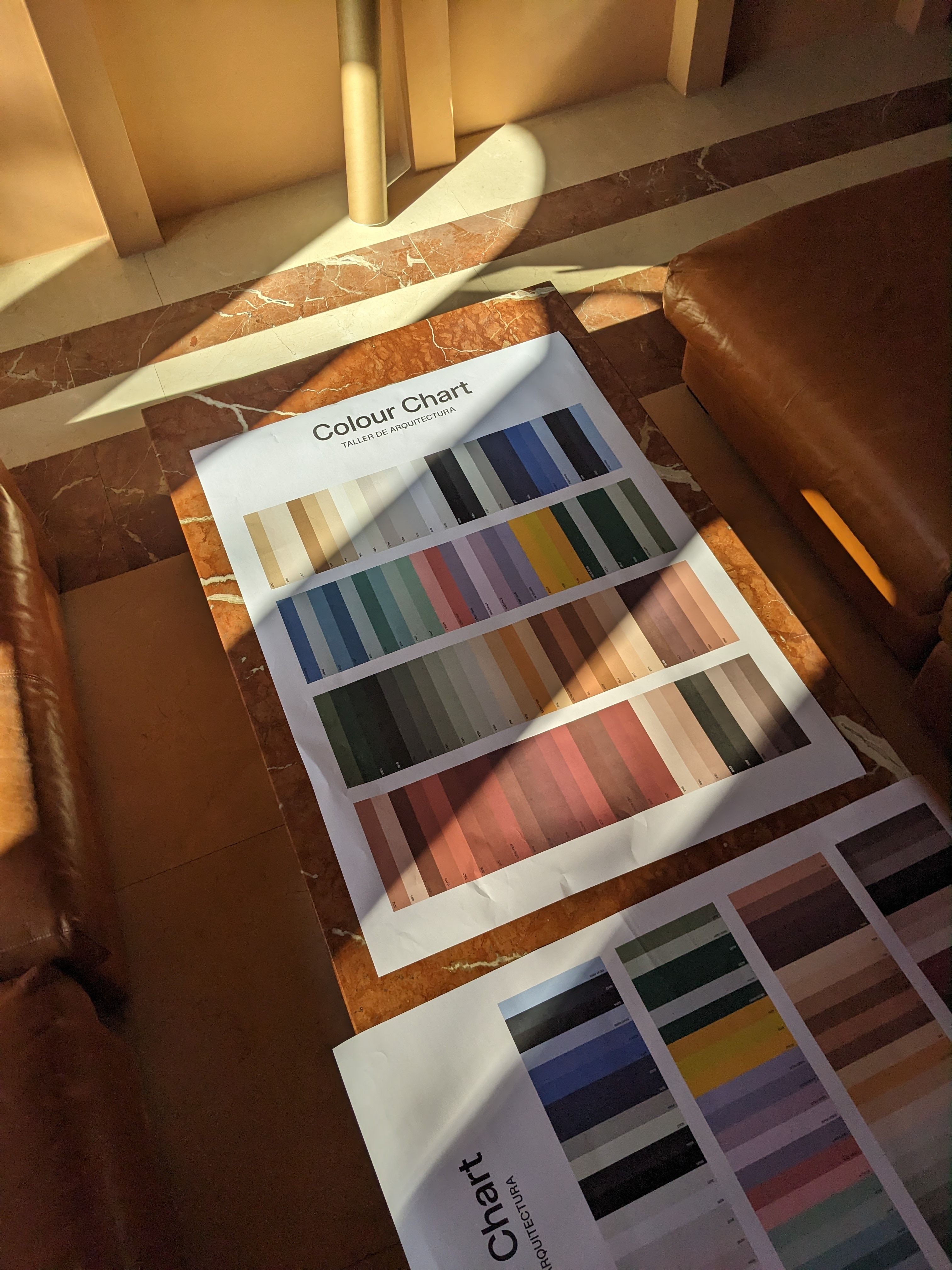
I remember at the beginning of the process we probably had around 300 colours...
Yes, or more, but the important thing was to synthesise, and in that effort, the colour chart became useful and not just a beautiful object. In the end, we arrived at the 100 current colours. Probably, some of these will never be used directly in works, but their presence in the chart allows you to eliminate options and choose the hue you're looking for. I like to think that after this work, if you look at the Colour Chart with squinted eyes, the entire chromatic universe of the Taller is there.
The Colour Chart seems to have two main uses: on one hand, it’s a didactic tool for architects, and on the other, it serves as a communication tool for external specifiers.
In addition to editing some fans with samples of the 100 colours as a practical tool, at Hernán's initiative, we decided to make a poster with a reproduction of the colours from the chart to be placed in each of the Taller’s workspaces. We didn’t allow colour references or codes to be included, because the aim was to bring the chromatic universe to the architects' view. Seeing these colours daily was an invitation to colour sensitivity. I believe it should be an inspirational tool.
You mentioned Le Corbusier earlier. He once described his own chart as “a tool that allows you to work with certainty.”
Exactly, with the creation of the Taller’s colour chart, the chromatic universe is defined and, by capillarity, is present in all current and future projects, allowing architects to work with certainty.